Enjoy being online again!
Welcome to the community of good people who base their values on evidence and appreciate civil discourse - the social network you will enjoy.Create your free account
10 comments
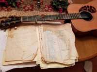
Feel free to reply to any comment by clicking the "Reply" button.Nice, but he needs a Gretsch country gent instead of the Thompson. Just kidding. I love the feel of it.
@ProudMerry I’m rather fond of Gretsches.
Looks a lot like my folder of lyrics and set lists, so of course I like it!
That would make an album cover I would never forget.
@ProudMerry
No... I grew up with bluegrass musicians, one whom I considered my grandfather. I still have his guitar. With that style music, sentiment goes for years.
@ProudMerry
I was fortunate to hear them every weekend at my grandmother's home. About 8 musicians would show up Saturday afternoon to play music. There was a guitar, fiddle, washtub bass, banjo, an auto-harp (my grandmother), and more of the same. My 'grandfather' also played the foot tap on the floor.
@ProudMerry
I truly am sorry. The last time. I heard mountain music live was too many decades ago. I love the album cover you took the time out of your day and your heart to put together!
Is that hinting at the kind of music too? Acoustic? Bluegrass?
@ProudMerry Maybe you could post some of his tunes on here?
@ProudMerry Wow! Really, really good!
@kmdskit3 Excellent!
I would photograph it in a different way. It's nice, but it doesn't look like an album cover. The folder of lyrics with the quilt and guitar looks great, the table looks out of place though IMO.
A gnarled wood or stone floor might look better?
Did he try it in B&W or Sepia ?
@ProudMerry and the lettering in a favorite color would make it jump !
Let me see if he tries it.
Enjoy being online again!
Welcome to the community of good people who base their values on evidence and appreciate civil discourse - the social network you will enjoy.Create your free account
Share this post
Categories
Agnostic does not evaluate or guarantee the accuracy of any content. Read full disclaimer.


