A wonderful example of how news channels (in this case, Fox News) manipulates those who watch it by "creative" data presentation - also called "lying with statistics".
Check the actual screen shot of how they presented it and then the next figure which shows how they should have presented it. Simple enough, but it works!
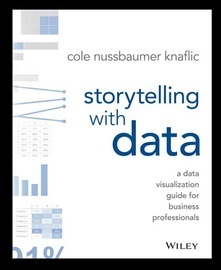
Credit: found this example in a book called "Storytelling with Data" by Knaflic (published by Wiley). A great read so far, highly recommend. Added cover pic for those interested.
I'm curious...can y'all find more examples of how the modern news manipulates us with data presentation?


Enjoy being online again!
Welcome to the community of good people who base their values on evidence and appreciate civil discourse - the social network you will enjoy.Create your free account
Enjoy being online again!
Welcome to the community of good people who base their values on evidence and appreciate civil discourse - the social network you will enjoy.Create your free account
Share this post
Categories
Agnostic does not evaluate or guarantee the accuracy of any content. Read full disclaimer.


