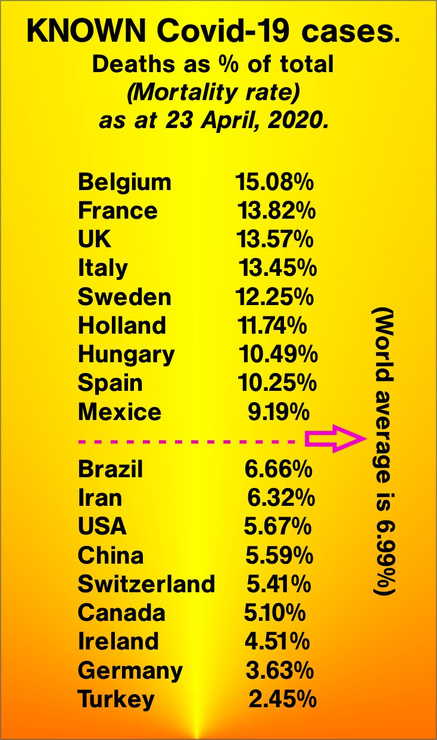
A mortality chart, in descending order, of the world's most affected countries. Germany and Turkey are included at the bottom, as they have a high number of confirmed Covid-19 cases, although a low mortality rate.
 2
2


Enjoy being online again!
Welcome to the community of good people who base their values on evidence and appreciate civil discourse - the social network you will enjoy.Create your free account
12 comments
Feel free to reply to any comment by clicking the "Reply" button.When I look at that site I can’t find the figures you present. By clicking on “death rate” at the top I see a long discussion about different rates reported by various entities, and most of those are from two to five percent.
When this is all over, the fatality rate of interest will be the percentage of a country’s population that died. In some previous epidemics up to nine percent of a population has died. So far this one is looking pretty tame: In the worst case Belgium has 576 deaths per million. That’s only six hundredths of one percent, and most of those were in bad shape already.
I think I’ll have a cup of coffee.
 WilliamFleming
Level 8
Apr 24, 2020
WilliamFleming
Level 8
Apr 24, 2020
0
Mexice? Border with Narnia?
 GipsyOfNewSpain
Level 9
Apr 24, 2020
GipsyOfNewSpain
Level 9
Apr 24, 2020
 1
1
Fat-finger-on-skinny-phone syndrome.
I like the percentage in Brazil... show that to a fanatic Christian... Lol!!!
 Paddypereira
Level 7
Apr 24, 2020
1
Paddypereira
Level 7
Apr 24, 2020
1
Wait, wait, wait.
These are rates as a percentage of total WHAT?
What is the source for this?
Who compiled, with data and from what source?
I will hold judgment on this post until more information is put forward.
A virus much more lethal than SARS-Cov-2 is already infecting the virtual world; it is called misinformation. I am not blaming Petter, but Petter, do you have the information to answer my initial questions? That would go a long way toward keeping us well informed. Thank you.
 Rodatheist
Level 7
Apr 24, 2020
Rodatheist
Level 7
Apr 24, 2020
0
Deaths occuring after known infection.
[worldometers.info]
@Petter Thank you very much.
So, if a country wanted to lower its death rate, all it has to do is conduct more tests.
I agree the numbers are not useful.
0
They are designed to give an idea of how badly it is affecting individual nations relative to each other.
@Petter So, each country has tested the same percentage of their populations?
@itsmedammit Nope, but this isn't for infections per million, merely for deaths in known cases.
No, tests are not the way to control the rate of infections. Social distancing is. México has only been testing the people that arrive to medical facilities showing symptoms. The way they have flattened the epidemic curve is with social distancing applied at the best possible moment.
@Rodatheist I was just trying to be a smart ass, and to point out the problem with the presented information.
Interesting. This gives us rough 7 % of those tested die. Some cases may involve a culture of widespread precautionary testing and others may only test those actively dying. This therefore gives us insight only into the effictiveness of testing the higher the precentage it is likely reflects those countries that test more often for cases that are very likely to test positive.
It also must be taken into account that a posituve test only gives us an idea where the virus is active and does nothing to cure the disease or stem its spread. Information is not "good" or "bad", that is determined by what one does with it. This is none the less interesting.
 DavidLaDeau
Level 8
Apr 24, 2020
1
DavidLaDeau
Level 8
Apr 24, 2020
1

The more testing done the lower the mortality rate. Without testing, how do you know they had Covid-19? You would know when they were hospitalized with symptoms, those people being more likely to die. Turkey? I'm don't believe figures coming out of Turkey.
 barjoe
Level 9
Apr 24, 2020
1
barjoe
Level 9
Apr 24, 2020
1
I'm going to need an accredited source for this. Where are these numbers coming from? Anyone could have just made them up off the top of their head. This is the way everyone needs to look at memes and any given information from now on.
 UrsiMajor
Level 8
Apr 24, 2020
2
UrsiMajor
Level 8
Apr 24, 2020
2
@Petter Ok. that's actually terrifying. Why?
1.) Worldometers puts the worldwide mortality rate at 20%
[worldometers.info]
2.) This is actually a valid source.

Just what is it a percentage of and what do we do with the figure? Known cases are a tiny fraction of all people infected.
Maybe the rate reflects a country’s effectiveness in treating those who are ill. If you assume that the known cases are of those sick enough to seek help, then the mortality rate might reflect the quality of care they receive. There are huge variables though. Some populations are older, for example.
WilliamFleming
Level 8
Apr 24, 2020
1

Useless statistics without information regarding the number and percentage of citizens tested.
 Lorajay
Level 9
Apr 24, 2020
2
Lorajay
Level 9
Apr 24, 2020
2
These are known deaths amongst known cases. As per the heading.
@Petter Lorajay's point is valid, the percentages are based upon known cases versus mortality and a lack of testing equals a lack of known cases. It is the one thing that I find so frustrating about this pandemic, the lack of reliable information.
@Surfpirate Yes, for all we know this chart could be relabeled, "the countries that best test their population & report collected data, in descending order". Most pandemics require 2-3 years before an accurate picture of what happened can be formed. Given the scope of this one maybe 3-5 years.
Enjoy being online again!
Welcome to the community of good people who base their values on evidence and appreciate civil discourse - the social network you will enjoy.Create your free account
Share this post
Categories
Agnostic does not evaluate or guarantee the accuracy of any content. Read full disclaimer.